|
|
DNA array data analysis |
DNA microarray technology opens up the possibility of measuring the expression level of thousands of genes in a single experiment. Serial experiments measuring gene expression at different conditions, times, or distinct experiments with diverse tissues, patients, etc., allows obtaining gene expression profiles under the different experimental conditions studied. Initial experiments suggest that genes having similar expression profiles tend to be playing similar roles in the cell.
Microarray experiments can be conceptually subdivided into material- and data-processing steps. During material processing, important information needs to be recorded, such as array design, experimental conditions and sample treatment, to enable meaningful data analysis and biological interpretation. Microarray data processing, which can be further divided into data preprocessing, such as normalization and filtering, data-analysis steps and the biological interpretation of the results.
The first steps in microarray data preprocessing involve image scanning, and include spot finding and the selection of good quality spots. Next, data-normalization steps are necessary to correct unavoidable experimental variations, such as differences in sample preparation, dye incorporation and hybridization efficiencies. These variations are not owing to differences in gene expression in the original samples and, therefore, need to be corrected before data analysis can be carried out. Such analysis might include various methods to identify genes that are differentially expressed or conditions (cell-culture treatments, diseases and so on) that result in similar changes in gene expression. Some normalization or data-analysis methods require special arrangements, such as a particular array design. Therefore, both material- and data-processing steps need to be considered at the early stages of a microarray experiment.
The biological interpretation of the data is facilitated by various tools, which place the analysis results into context with existing biological knowledge, such as the scientific literature or sequence data. Efforts to unify and standardize the way in which information is recorded are making the interpretation of large-scale experiments easier.
Finally, the integration of biological information from various sources, such as large-scale data sets produced by various experimental techniques, provides a valuable platform for the exploration of regulatory networks.
If we had the images, we could quantify the amount of each of the fluorescent probes in every spot, remove results for problematic spots. This could be done with one of the many software available like Scanarray, GenePix. It will also be necessary to normalize the arrays. For example, we can use DNMAD for this task.
We have to merge the results of all the experiments we want to use into one file. If our experiments are in a Data Base, we will have to use the available tool for extracting the results. If we have the results in flat file, we could use a text editor or a SpreadSheet.
Next, we have to preprocess the patterns. This step includes the transformation of the scale, the handling of missing values, the removing of flat gene expression patterns and the standardization of the remaining patterns. Those steps are optional and depends on the actual data set.
To know more about preprocessing, see the tutorial on gene expression pattern preprocessing.
This step will group the gene expression patterns. We can use any of the available methods and compare the results.
An alternative step to clustering is differential gene expression analysis, which involves finding genes showing significant differences in two or more experimental conditions or correlated to another phenotypic trait or experimental condition independent of the expression values (e.g. drug dosages, survival, level of a metabolite, etc.). This module, called Pomelo, is a tool that has been designed to address the problem of multiple testing when searching for differentially expressed genes. We have implemented four methods to account for multiple testing; two of them control the Family Wise Error Rate and two others control de False Discovery Rate. These methods can be applied to five different statistical tests: the t-test (to compare expression between two conditions), ANOVA (Analysis of Variance, to compare expression between two or more con-ditions), linear regression (to examine if the expression of genes is related to variation in a continuous variable, e.g. expression levels of a given metabolite), survival analysis [to examine if gene expression is related to patients' survival] and Fisher's exact test for contingency tables (when both the dependent and independent variables are categorical).
The rationale behind clustering is that, despite the grouping being established by means of a given distance measure, it must reflect some biological property or function. The next step in the analysis consists of extracting the information and biological characteristics common to groups of genes of interest. Unfortunately, a large number of the available resources compiling information on gene (or protein) function or properties are based in the pre-genomic design in which the information is acceded and displayed in format one-gene-at-a-time. Such resources are useless if the aim is to detect some biological property or function shared by a set of genes when thousands of them are involved in the comparison. This gap between the clustering and the final study of the available information for a set of selected genes cannot be performed by hand because the amount of information implied in this step is too great to be processed by traditional methods.
A module for data mining, FatiGO, that allows finding significant asymmetrical distributions of GO terms between groups of genes. This constitutes an extremely useful tool for exploring the biological meaning of the groups or arrangements of genes found by using the previous methods.
DNA microarrays are part of a new class of biotechnologies that allow the monitoring of expression levels in cells for thousands of genes simultaneously. In order to accurately and precisely measure gene expression changes, it is important to take into account the random (experimental) and systematic variations that occur in every microarray experiment.
Sources of variation (not related with variation due to biological causes) include:
- Differences in the labeling (i.e., dye biases)
- Differences in the sample preparation
- Differences in the hybridisation
- Differences in the photodetection
- Autofluorescence
The goal of normalization is to adjust for effects that are due to variations in the technology rather than the biology. In particular, we will try to adjust for differences in the red and green labeling caused, for example, by differences in the binding of the labels; a widespread phenomenon are differences in the labeling (i.e., dye biases) that are related to intensity (the typical curvilinear MA plots).
Let's see several plots used for the diagnosis and normalization of microarrays. Click here.
Now, think about the next experiment. Imagine that we extract mRNA form a mouse liver, we split the sample in two and we label each sample with cy3 and cy5 respectively. Later we hybridise those two samples into the same array. What should we expect from the MA plot?
Below there are two plots for an experiment in which two identical mRNA are labeled with different dyes and then hybridized to the same slide.
If there weren't any differences in the labeling, or in the photodetection, the values should be distributed around an M of 0 since we're hybridizing identical mRNA, but as we can see in the plots this is not the case, so the need for normalization becomes evident.
We provide a web interface to help in the normalization of cDNA microarray data, DNMAD (Vaquerizas et al., 2004). The method implemented is the print-tip loess as explained in Yang, Dudoit, Luu, Lin, Peng, Ngai, and Speed (2002). "Normalization for cDNA microarray data: a robust composite method addressing single and multiple slide systematic variation". Nucleic Acids Research, Vol. 30, No. 4, e15.
With print-tip loess, the majority of genes are used for the normalization. Thus, we are assuming that most genes are not differentially expressed, that there is approximately an equal number of up- and down-regulated genes, and these assumptions should also hold for each print-tip group (see also Yang et al., p. 4). If these assumptions are unreasonable (e.g, a small custom-made array where most genes are differentially expressed), this method should not be used.
The program expects GenePix GPR files. Please, use the format as it is in the gpr files. Details about the GPR format & example.
You can enter either a number of individual GPR files or a compressed file containing all the arrays in GRP file format.As resutls, you are given the box-plots of the log (base 2) ratio before and after print-tip loess normalization. This allows you to assess the need for slide scale normalization (a normalization that will ensure the same scale for all arrays).
Box plots for each array show box-plots, before and after normalization, of the ratio for each array. This allows you to assess if the scale of different print-tip groups is comparable.
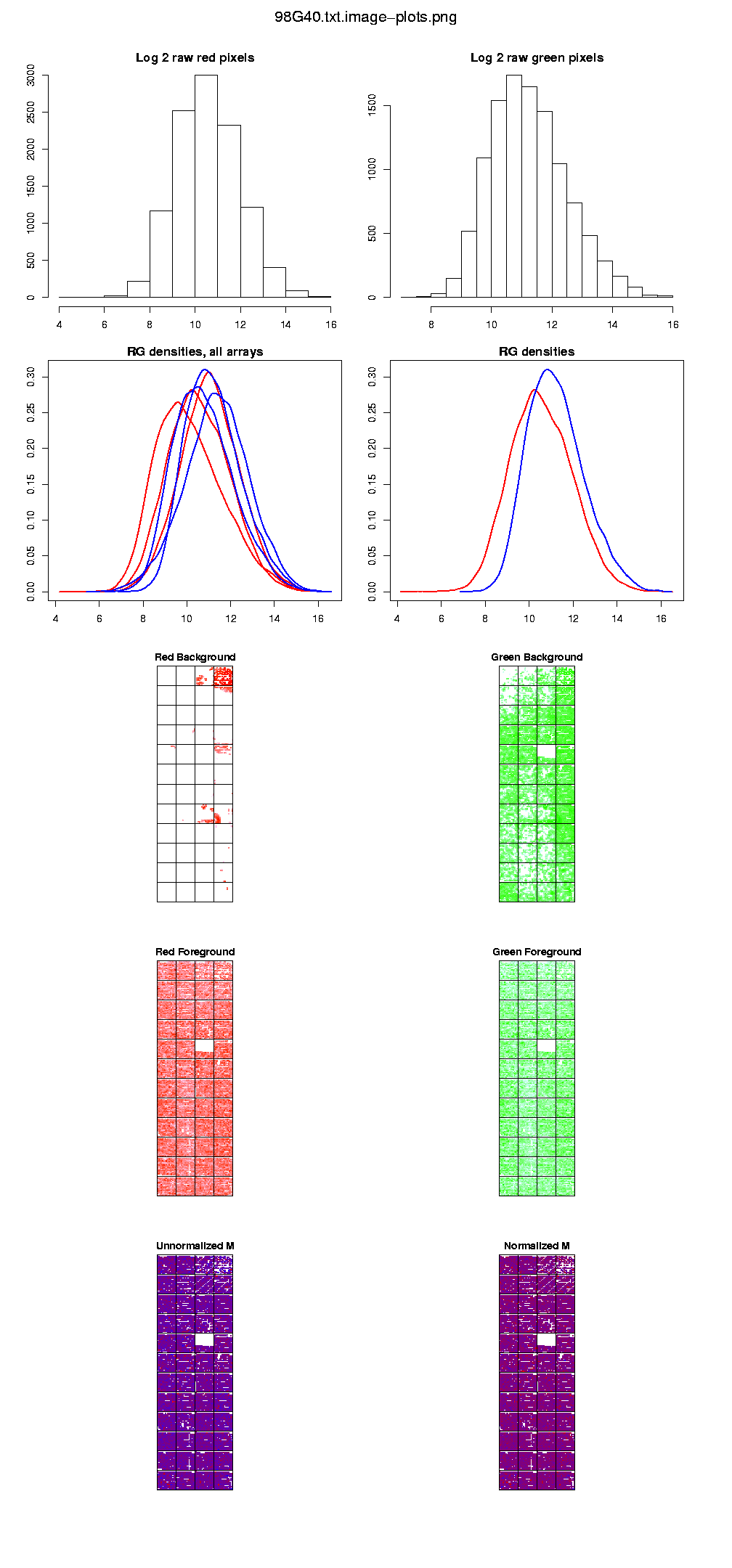
Image plots (which include the histograms of the raw intensities) to check the quality of your arrays.
MA-plots show the relationship between A (the "average signal" [0.5 * (log R + log G)], where R is the background subtracted red [mean of F635 - median of B635] and G the background subtracted green [mean of F532 - median of B532]) and M (the log [base 2] differential ratio: log(R/G)).
Also, the program returns a file with the normalized M and A values. These M values are always from the log (base 2) ratio of 635/532 (or Red/Green). If your experimental setup would require the 532/635 ratio, just flip the signs of the output. The A values are the "average signal" [0.5 * (log R + log G)].
Using DNMAD
Exercise 1
The file for this exercise is here. Save this file to your desktop.
This file is a compressed file containing 3 different arrays.
Go to the application URL (http://dnmad.bioinfo.cipf.es) and select the file you have just downloaded. Also, enter the layout of the microarray. For this exercise, the layout values are 12 x 4 and 18 x 15.
Check the option "Use backgorund subtraction" and leave the others as defaults.
Press the "RUN" button and wait for the results. The results are also here.
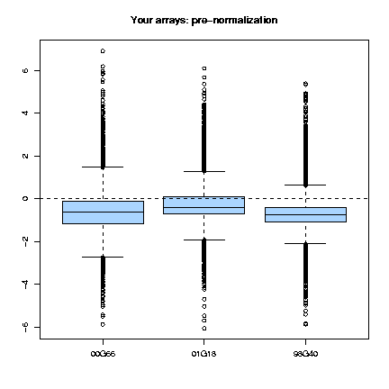
The boxplots for all the arrays show that before normalization, the values in the array are not centered about an M equals to 0, as it shoud be (see the assumptions), so there is a clear need for normalization.
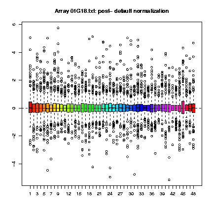
Clicking on the button labeled "View all" in the column of the boxplots, we can examine how the normalization procedure has worked for each individual array within each print-tip-group.
Clicking on the button labeled "View all" in the column of the Ma-plots, we can see how the regresion curve has been adjusted to an M equals to 0 as it should be under our assumptions.
Clicking on the button labeled "View all" in the column of the diagnostic plots, we can check for corrupted arrays, or for bad scanner settings and so on.
Looking at the MA-plots it seems to be that the normalization procedure has worked alright for our arrays and that they are ready to start the analysis, but the print-tip-group boxplots and the diagnostic plots do not show the same.
Looking at the boxplots we can observe that group 45 is a bit out of scale, particularly in arrays 00G66.txt and 01G18.txt. This may induce us to think that there is a defect on the needle that printed these groups.
Also, we can also observe that in array 98G40.txt there is a problem in print-tip-group 4. Looking at the diagnostic plot we can observe that the red background is almost saturated for these print-tip but not fot the others, indicating problems with the hybridisation in this group.
We can also observe that there are some white dots in the diagnosis plot that shows the M of the array (log 2 of the ratios). These are going to be considered missing values ("NA") because you have more background than foreground so the log2 of the ratios can not be calculated. If you can go on in spite of these errors, we're ready to start our analysis process.
In order to do this, we have two different options:
- Download the results file to use it with your prefered analysis suite
- Send the file to the Preprocessor directly
Next, we have to preprocess the patterns. This step includes the transformation of the scale, the handling of missing values, the removing of flat gene expression patterns and the standardization of the remaining patterns. Those steps are optional and depends on the actual data set and on the methods that you have used previously. For example, if you use DNMAD for normalization, the step of scale transformation becomes unnecessary as you've got your data in log2 scale already.
These are the transformations available in the Preprocessor (Herrero et al., 2003):
- Scale Transformation
- Replicate Handling
- Missing Value Handling
- Flat Pattern Filtering
- Unknown Gene Removing
- Pattern Standardization
Also there is a "Pre-Analysis" module that performs several checks and plots different histograms to help and to guide the user through the options. It automatically selects or unselects different options and gives useful information to the user.
Here is the list of topics covered by the pre-analyse module:
It is important to emphasize that the Pre-Analyse module does not change the original file: the user can ignore the recommendations simply by unselecting the corresponding options.
- File format: it checks that all the patterns have the same number of conditions. It adds extra missing values or removes extra ones if needed. It also checks that all the patterns have a valid identifier. It adds a unique one when necessary. It also keeps a list of symbols interpreted as missing values and displays this information. A warning message is displayed if there are too many of them, as could happen if the file uploaded is in a wrong format.
- Dimensions of the data set: the server expects a dataset with more rows (genes) than columns (experimental conditions). It displays a warning message if it founds more conditions than patterns, as could happen if the data matrix is transposed.
- Scale of expression patterns: the server plots the histogram of values found in the data set and looks for negative values. It assumes the user did not log-transform the dataset if none is found. It displays a warning message, log-transforms the data internally to continue with the analysis, auto-selects the option for log-transforming the dataset and plots the new histogram of log-transformed values.
- Replicated genes: the server looks for replicated genes and merge them into their average pattern. The list of replicated genes as well as the number of them is displayed. The server also plots an additional histogram of distances to median of replicates to guide user in selecting a good threshold for removing inconsistent replicates.
- Missing values: the server obtains the number of missing values for this dataset and suggests the best imputation method among the available ones depending on the amount of missing values, the amount of complete patterns and the number of conditions. It also plots an histogram of the number of missing values by pattern.
- Histogram of peaks: this histogram informs the user about the number of remaining profiles after using the ``Filter flat patterns by number of peaks'' option versus the threshold used.
- Histogram of RMS: this is the histogram of RMS in the data set.
- Histogram of stddev: this is the histogram of stddev in the data set.
To know more about preprocessing, see the tutorial on gene expression pattern preprocessing.

Same clustering with a symbolic representation using a confidence level in the variabiliy value of 95%.

If you have your own data you can go directly to the server: Sotarray Server
Go to data sets page clicking here:
Select Diauxic shift:
(Optional) Note in the different files the steps in the treatment of the data
Choose a file (data_norm.txt, for example) and send it to the server by clicking here:
Select SOTA server:
|
Select Unrestricted Grow option
Click on Run.
Send result to TreView server to see the tree:
|
Accept default parameters and press Run
Go back by clicking here:
|
Uncheck Gene Names change to 1 the value of Vertical Separation
Press Run again.
2nd Part:
Close the window and go back to the Sotarray result screen
Press Change Parameters button to modify`parameters:
|
Select Variablity Threshold (%) option and set the value to 90 (default).
Press Run again.
Send the results both to TreeView and al SotaTree:
|
|
Compare the results
If you have your own data you can go directly to the server: Cluster Server
In data sets page choose one of the experiments.
Choose a file and send it to the server by clicking on the sota/cluster link.
Go to the Cluster server
|
Accept dafault values (UPGMA and correlation) and press Run
Send result to TreeView to display the tree:
|
Choose the change parameters option, uncheck Gene Names and set the Vertical Separation to 1.
Press Run
If you have your own data you can go directly to the server: SOM Server
From data sets page, choose an experiment.
Send file to the server following the link: som
Send it to SOM:
|
Accept default values and press Run
One of the most interesting problems consists of finding genes differentially expressed among two or more conditions (e.g. different cancer types). Conceptually related to this is finding genes related to a given continuous variable (e.g. the level of a metabolite) or the case of survival, a particular case of a continuous variable. Nevertheless, finding the proper group of genes among the thousands present in the arrays is not an easy task.
The Pomelo tool has been designed to control the problem of multiple testing when searching for differentially expressed genes. Using microarray data we are testing for differential expression of a high number genes and we need to account for multiple testing. The problem of using the p-value from each test directly is that we are examining many null hypotheses (one null hypothesis i.e. non differential expression for each gene). If we were to consider each of the tests with a p-value smaller than, say, 0.05, as significant, we would end up with an excessive number of differentially expressed genes. Despite this, not many authors are aware of this problem and few programmes consider multiple testing in their design. The need to account for multiple testing has been reviewed for the analysis of microarrays by Dudoit et al. In Pomelo we have implemented four methods to account for multiple testing; two of them control the Family Wise Error Rate (21) and two others control de False Discovery Rate.
These methods can be applied to five different statistical tests:
- t-test: to compare expression between two conditions. For example, we could compare gene expression data between two types of patients.
- ANOVA: analysis of variance, to compare expression between two or more conditions. For example, the gene expression among five types of cancer.
- linear regression: to examine if the expression of genes is related to variation in a continuous variable, e.g. expression levels of a given metabolite. A typical example is predicting body weight (the dependent variable) using height as the independent or predictor variable.
- survival analysis: to examine if gene expression is related to patients survival. With survival data we often have censored observations (e.g., a patient that is not yet dead, and all we know is that it lived for at least 100 days after initiation of the treatment).
- Fisher's exact test: for contingency tables when both the dependent and independent variables are categorical. This test would be the one to use if we have, say, different classes of patients (e.g., six types of cancers) and for a set of 1000 markers we can have either presence/absence of each marker in each patient (this would yield 1000 contingency tables of dimensions 6x2 ---each marker by each cancer type), or we can have several levels of (unordered) expression, say four types of expression (which would yield 1000 6x4 tables).
Program input
Data files and format
The files "Covariates" and "Class labels or dependent variable" are required. In addition, if your data are survival data, you need to provide a file with the "Censored indicators".
- Covariates file
- The file with the covariates; generally the gene expression data. In this file, rows represent variables (generally genes), and we want to find those variables that are most distinctly expressed among groups (e.g., a t-test or ANOVA) or that are most related to, say, survival (e.g., Cox model).
Class labels or dependent variable- These are generally the class labels (e.g., healthy or affected, or different types of cancer) that group the samples, or the survival times of patients, or another dependent continuous variable (if regression models). In our analyses we want to find which of the covariates is significantly different among (between) the classes given here, or which of the covariates is significantly related to the dependent variable.
Censored indicator- For survival data only. An observation is censored if the time of occurrence of the event (usually death) has not yet been observed. We will represent uncensored observations with a 1 (because we do have observed the time of death) and censored observations with a 0 (meaning that the survival time given is only a lower bound).
Data format for covariates
The file for the covariates should be formated as:
- Data should conform to the "genes in rows, patients (or classes) in columns". In other words, each row of the data file is supposed to represent a different gene or variable and we will carry-out one test for each row.
- Use tab (\t) as the field separator within rows.
- Use newline or carriage return (\n) between rows. It is also convenient to finish each file with one (\n).
- There should be no rows with non-numeric data. In particular, eliminate initial rows that contain things such as headers with the IDs of patients.
- The first column is assumed to contain the ID information for genes, marker, or whatever. This will be used to label the output (but it also means that whatever is in the first column is not used in the analyses).
- You can have an arbitrary number of rows with comments. These rows must always start with an "#".
- (For those of you familiar with SOTA, you will see that data formating is the same as for SOTA, except we allow a little bit more flexibility in the coding of missing values ---see below).
- Missing values can be coded in three different ways: a) as "NA"; b) with one empty space (i.e., " "); c) as nothing (i.e, simply leave these places empty, as in SOTA). However, you can have PROBLEMS if the number of missing data in any row (gene) is equal to the number of subjects in the smallest category - 1. This is because in the permutation test you can have all the missing values assigned to the smallest category, but to compute the variance of a sample you need at least two subjects.
- This is a small covariate data file using "NA" for missing values:
gene1 23.4 45.6 NA 76 85.6 genW@ NA 34 23 NA 13 geneX# 23 25.6 29.4 13.2 NA- This is the same file using nothing for missing values:
gene1 23.4 45.6 76 85.6 genW@ 34 23 13 genX# 23 25.6 29.4 13.2- This is the same file using nothing for missing values and a first row with comments:
#ID g1 g2 g1 g1 g2 gene1 23.4 45.6 76 85.6 genW@ 34 23 13 genX# 23 25.6 29.4 13.2- In the last example, the first row is used to make it clearer, to the human user, what the different columns are. And that first row, conveniently edited, could be used as the data for the class labels. The program, however, will discard that row of data, since it is preceded by an "#".
Data format for class labels and censored indicators
Separate values by tab (\t), and finish the file with a carriage return or newline. No missing values are allowed here. Class labels can be anything you wish; they can be integers, they can be words, whatever. Of course, if you are using regression or Cox model, your dependent variable must be a number. And if you are using a t-test there can only be two classes.
This is a simple example of class labels file
CL1 CL2 CL1 CL4 CL2 CL2 CL1 CL4Data format for Fisher's exact test on contingency tables
The class labels, as above, can be any arbitrary coding. The values in the covariate data file should be consecutive integers that start at 0 (i.e., do NOT use negative intergers, or you'll get errors). This is an example file:
#gene   c1      c1      c2      c2      c3      c3
gene1	0	0	1	1	1	0
gene2	NA	2	NA	1	0	0
gene3	NA	1	2	NA	0	0
gene4	1	1	2	2	2	0
gene5	1	0	0	2	1	2
gene6	2	1	1	2	0	0
gene7	2	1	1	0	2	0
gene8	2	2	0	0	NA	NA
As you can see, most of these rows would yield (if we used the first row as the class labels) 3x2 tables or 3x3 tables (e.g., 3rd or 5th rows).
Output files
The run of the program returns two files, one with results and another one with a log of the run. The program also returns an image in which you can visualize the results.
Results file
The results file looks like this:
 Function call:                         ./multest2 Regres maxT 5000 covar-surv-2.txt survival_data.txt
 Data file:                             covar-surv-2.txt
 Class file:                            label.txt
 Number of variables or genes:          10
 Number of columns:                     25
 Type of test:                          t
 MinP or MaxT?:                         maxT

 Permutations used:                     5000
 Random seed:                           1029251818

##################################################################################


Row                 ID       unadj.p       adj_p         FDR_indep       FDR_dep         obs_stat
       4          sdg4      0.0141972        0.126        0.141972         0.41583         2.70352
       9         VA254      0.0979804        0.604        0.489902               1         1.74547
       1          X125       0.276345       0.9302        0.771846               1         1.11924
       3     VZY2768g3       0.321936        0.945        0.771846               1        0.998899
       7         UV@#3       0.385923       0.9462        0.771846               1        0.891093
       2            g2       0.511298       0.9752        0.773845               1        0.655166
      10           Z34       0.766847        0.996        0.773845               1        0.318601
       6         CF234       0.756049        0.996        0.773845               1        0.318009
       8            g8       0.757449        0.996        0.773845               1        0.314569
       5            g5       0.773845        0.996        0.773845               1        0.295557
The first lines of the results file provide information about the run (function call, names of files used, number of random permutations, seed of the random number generator, etc).
The actual results are shown in table format (and should be easy to read into you favorite stats or spreadsheet program).
- Row
- The row of the original file. Note that rows are re-ordered by decreasing value of adj_p, or the adjusted p-value. Of course, usually your own data will contain many more rows (in the order of thousands?) than this example.
- ID
- The original ID information included in your file (the first column of the data).
- unadj.p
- The unadjusted p-value; in most cases, this p-value is obtained using the random permutations, where each row-wise p-value is based only on the results for each row or gene. With Fisher's exact test, this is the exact p-value using Fisher's exact test procedure.
- adj_p
- The adjusted p-value for control of the FWER using step down maxT.
- FDR_indep
- Adjusted p-value using the FDR procedure of Benjamini & Hochberg.
- FDR_dep
- Adjusted p-value using the FDR procedure of Benjamini & Yekutieli that provides strong control of the FDR under arbitrary dependend structures.
- obs_stat
- The observed test statistic from the data. Except for Fisher's exact tests for contingency tables, these are the type of tests statistics used in the maxT procedure. For Fisher's test on contingency tables this column is an NA since we use the minP procedure directly on the exact p-values from the contingency tables. For the tests implemented now the observed statistics are:
t- The absolute value of the difference of means divided by the square root of the sum of the sample variances of each of the means. (So just the usual t for the unequal variance case).
- ANOVA
- The usual F-ratio (mean squares model/mean squares error).
- Regression
- The coefficient divided by its standard error (i.e., the typical t-statistic).
- Cox model
- The absolute value of the Wald statistic (the estimate of the coefficient divided by its standard error).
You should note that test statistics are given in absolute value; you might want to use the signed test statistics for your biological inferences. In fact, we strongly suggest to use figures; actually, we don't give the signed statistic to encourage you to look at the data to see the direction and type of deviation. (And because for some tests the idea of "signed statistic" is meaningless, such as with ANOVA).
To comment on this simple example, after correcting for multiple testing, no gene shows statistically significant different expression after correcting for multiple testing, in spite of the first one having an unadjusted p-value < 0.05.
Pomelo's image
An image is provided as another way of looking at Pomelo's results. Each row is a gene and each column is a sample.
Rows are ordered by increasing adjusted p-value. First row corresponds to the row with the smallest adjusted p-value according to Pomelo's results, next one is the second lower adjusted p-value and so on.
Columns are ordered by classes in alphabetical order.
If you have a row with the names of columns, that row must start with "#name". For example:
#name	g1	g2	g1	g1	g2
gene1	23.4	45.67		6	85.6
genW@	34		23		13
genX#	23	44	25.6	29.4	13.2
Adjusted p-value and FDR indep. value (adjusted p-value using the FDR procedure of Benjamini & Hochberg), are shown at the start of each row. See Pomelo's help (Results file section) for details.
Once the first image is displayed, you can generate as many images as you want by filling the form that is under the image. New images will be displayed in a new window.
Using Pomelo
Exercise 1
The covariates file for this exercise is here. Save this file to your desktop.
The class file for this exercise is here. Save this file to your desktop too.
The covariates file is a tabulated file containing data of an experiment in which we have gene expression of 3808 genes in 50 patients (7 normal and 43 cancer patients), and the class file contains the class that this column belongs to (N for normal and T for tumor).
Go to the application URL (http://pomelo.bioinfo.cipf.es) and enter the covariates file and the class file that you have just downloaded.
Select the t-test since we're going to compare two classes. Leave the permutations in 10000 and leave the question about normalization in "no" (this is just for the image scale).
Press the "RUN" button and wait for the results (a couple of minutes). The results are also available here.
You will get an image more or less like this:
Take note that if we don't use the adjusted p-value, the number of genes selected as different between the two classes will be more than 700. Using adjusted p-values this number is reduced to 11.
Now we can send genes from this experiment to the FatiGO. We can do this in two ways. The first one is an informative way. We use the list option from FatiGO.
First we select a p-value as threshold to select the list of genes; the group of genes sent to FatiGO will be all those genes with a p-value smaller or equal to the one you select.
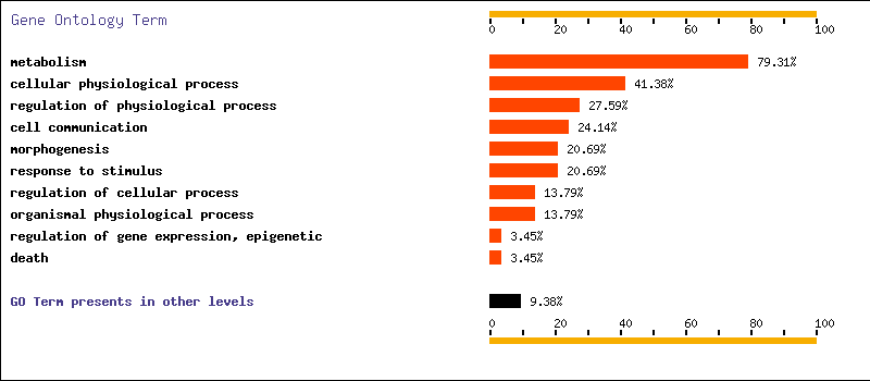
In this case, if we use an adjusted p-value of 0.05 to make the selection, and we choose "Human" as database, we get that nearly a 80 percent of the selected genes are related to metabolism and that more than a 40 percent of them are related to cellular physilogical processes. The results are also here.
We can also use the FatiGO to compare two groups of genes. In this case, we will use the p-value as a threshold to select the genes. The comparison will be between all the genes with a p-value smaller or equal than the selected p-value vs. all the genes with a p-value larger than the selected one. In order to use this feature, we have to make sure that your gene names are supported by FatiGO.
In this case, if we use a p-value of 0.05 as threshold and we select Human as the database, we don't get any significant go term differentially represented between the genes differentially expressed and the others. Results
Perhaps one of the most demanded kinds of tools are those that can transfer biologically relevant information to microarray experiments. This information can be extracted either from free text (e.g. Medline abstracts) or from more or less curated repositories. The use of text mining techniques in studying the coherence of gene groups obtained from different methodologies has only recently been addressed, although its practical application still poses many drawbacks. Furthermore,availability to end users is often scarce. Gene Ontology, which organizes information for molecular function, biological processes and cellular components for a number of different organisms, and KEGG, which includes a comprehensive description of different pathways, are among the most used curated repositories of information. Different tools, which generate tables correlating groups of genes to GO terms regarding biochemical and molecular functions, have been recently implemented and the web page of the GO consortium. Among them is FatiGO,can deal with thousands of genes and extract the GO terms of relevance for a given set of genes with respect to the rest of them. These terms are obtained with the application of a test that takes into account the multiple-testing nature of the statistical contrast. The module produces a graphical representation with a bar chart with the proportion of GO terms in the analysed cluster with respect to the cluster of reference. Adjusted p-values for the differentially represented GO terms are given too. Also, links to the GO terms as well as to the genes are provided. FatiGO has the advantage of being integrated within the GEPAS platform.
7.1.What is FatiGO?
FatiGO is a web interface which carries out simple datamining using Gene Ontology for DNA microarray data. The datamining consists on the assignation of the most characteristic Gene Ontology term to each cluster. GO terms are related to Human, Mouse, Fly, Worm and Saccharomyces genes and proteins. The assignation of the most relevant GO terms to each cluster is performed by means of a chi-square test. Since each gene can contribute with a different number of GO terms to the p-value for the total chi-square test is obtained by means a permutation test.
7.2. Program Input
Databases
Select suitable database for your genes query. Each Gene of these databases has one or more Gene Ontology terms annotated.
- Gene Ontology June 2004
- UniGene Build #170 Homo sapiens
- UniGene Build #137 Mus musculus
- Mouse Genome Database software Released date: 06/04/2004
- Saccharomyces Genome Database Released date: 06/17/2004
- FlyBase Released date: May 22, 2004
- WormBase Released date: 05/11/2004
- Rat Genome Database (RGD) Released date: 05/13/2004
- Arabidopsis Information Resource (TAIR) Released date: 05/28/2004
- GOA Human 20.0 Released date: June 04 2004
- GOA UniProt 18.0 Released date: June 04 2004
- Ensembl Human v. 19.34b
- Affymetrix: AFFY_HG_U133A, AFFY_HG_U133A_2, AFFY_HG_U133B, AFFY_HG_U133_PLUS_2, AFFY_HG_U95A, AFFY_HG_U95Av2, AFFY_HG_U95B, AFFY_HG_U95C, AFFY_HG_U95D, AFFY_HG_U95E
Ontology and Level
A gene product can have one or more molecular functions, be used in one or more biological processes and may be associated with one or more cellular components. You want to know the distribution of your genes in a specific ontology (function, process or component).
You must select the ontology and also the GO term´s level [ 2 - 5 ]. The optimum levels for the three ontologies where are located most genes is >=3.
Inclusive analysis
FatiGO performs the analysis on nodes of the GO hierarchy (DAG). If the level corresponding to (e.g.) apoptosis was selected. Any gen annotated as either apoptosis or as any children term was considered in the same category for the test. This increases the power of the test. We have to test less terms with more genes.
GO Terms Genes GO:0006915: apoptosis BCL2-like, plasminogen GO:0042981: regulation of apoptosis Caspase6, Caspase7, Caspase9 GO:0043066: negative regulation of apoptosis Caspase2 GO:0006917: induction of apoptosis Caspase12, Interleukin 9 Level chosen for inclusive analysis
In the example, choosing apoptosis node for the analysis will assign 8 genes to the term corresponding to the node. If inclusive analysis is not used, then four terms apoptosis (with 2 genes), regulation of apoptosis (3), negative regulation of apoptosis (1) and induction of apoptosis (2) are taken into account with the obvious decrease in the power of the test.
Data and format
The data can be Gene Symbol, Cluster Ids, standard name or systematic name for each suitable database.
If you download a file:
For a excel file the Gene or protein Id must be in one column
For a text file put one gen or protein by line.
- Human
- Enter in the search box the UniGene Cluster Id for human with the format Hs.--- or the Gene symbol for each gen or SWISS-PROT/TrEMBL entry name or Ensembl peptide identifiers (ENSPxxx....) - and Ensembl gene (ENSGxxx..) for human. Example: ClusterId: Hs.4994 or Gene Symbol: TOB2 SWISS-PROT/TrEMBL: HAX1_HUMAN. Ensembl: ENSG00000104691 or ENSP00000264167
- Mouse
- Enter in the search box the UniGene Cluster Id for mouse with the format Mm.--- or the Gene symbol for each gen..
Example: ClusterId: Mm.4994 or Gene Symbol: Tnfsf4.- Saccharomyces Genome Database
- Enter in the search box a standard or systematic sequence name .
Example: Standard name: RRP5 or Systematic name: YMR229C.
- FlyBase
- Enter in the search box a Gene symbol .
Example: Gene symbol: Ace
- WormBase
- Example: ID: C39B5.5
- Rat Genome Database
- Example: Gene: Atp2a
- Arabidopsis (TAIR)
- Example: Gene: ABI4
- SwissPROT/TrEMBL (Uniprot)
- Enter in the search box a SWISS-PROT/TrEMBL entry name.
Example: Entry name: IPUA_ASPNG .
- GenBank (accesion number)
- Enter a accesion number Genbank nucleotide database.
Example: Accesion: AK0076817.3. Include Reference Cluster
If you want study of the differential distribution of GO terms for two sets of genes, you must include a reference group of genes. In this case FatiGO extract relevant GO terms by the application of a test that takes into account the multiple-testing nature of the statistical contrast performed.Also you can select if the multiple test include adjusted p-values (control FWER) or not. The result show a comparative graphical view with the distribution of GO terms and the p-values:
- Unadjusted p-value
- Step-down min p adjusted p-value
- FDR (independient) adjusted p-value
- FDR (arbitrary dependent) adjusted p-value
The p-value after adjusting for multiple testing. We are simultaneously testing multiple null hypothesis (one for each GO term) of no difference in the frequency of terms in each cluster. If we were to simply report the p-value from a Fisher's exact test or a chi-square test, we would be increasing the Type I error rate. The application of a procedure for multiple testing allows us to try to determine which of the GO terms differ between the two clusters, while at the same time controlling the Family Wise Error Rate.
- Unadjusted p-value
- The unadjusted p-value; in most cases, this p-value is obtained using the random permutations, where each row-wise p-value is based only on the results for each row or gene. With Fisher's exact test, this is the exact p-value using Fisher's exact test procedure.
- Adjusted p-value
- The procedure we have implemented here uses the step down max-T procedure (see details, for example, in Westafall & Young, 1993, 'Reampling-based multple testing', John Wiley & Sons), with a test statistic that is equivalent to Fisher's exact test for 2x2 contingency tables. The number of random permutations is set at 10000, unless the total number of possible arrangements of the data is smaller than 10000, in which case we use complete enumeration.
- FDR (independient) adjusted p-value
- Adjusted p-value using the FDR procedure of Benjamini & Hochberg;
- FDR (arbitrary dependent) adjusted p-value
- Adjusted p-value using the FDR procedure of Benjamini & Yekutieli that provides strong control of the FDR under arbitrary dependent structures.
7.4. Using FatiGO
Examples
For Saccaromyces
These files has interacting proteins in the yeast. One file include overinteracting proteins and the other one is a file with underinteracting proteins .
Cluster_Query overinteracting proteins
With FatiGO you can study the biological process of this proteins involved in interactions and finding the GO terms differentially represented in both sets.
Cluster_Reference underinteracting proteins
Include these files in FatiGO select Saccaromyces Genome database, ontology biological process and level 3. Also You can choose the multiple test with or without adjusted p-values (control of FWER).For Human
Example Human genes involved in apoptosis processes
Using SOTA
This data set corresponds to an experiment carried out by a grop of the Stanford University about the diauxic shift in S. cerevisiae
1st Part:
Go to data sets page clicking here:
DNA-arrays: Public Data Sets Select Diauxic shift:
Diauxic Shift Data Set (Optional) Note in the different files the steps in the treatment of the data
Choose a file (data_norm.txt, for example) and send it to the server by clicking here:
Select SOTA server:
Send To Sotarray Click on Run.
Send result to SotaTree server to see the tree:
Send To SotaTree Accept default parameters and press Run
In this figure the size of the circles represents the number of genes in the cluster, with the value of the average pattern on its right.The variability is defined in each cluster as the largest among all the pattern-pattern distances in it. Thus the two more divergent patterns in a cluser define the radius of variability of the cluster. The confidence level is based on a resampling test of the pattern values. See SOTA tutorial for details.

Click on the circle with 81 genes.You will get two new windows:
- one with a plot with the profile of the cluster pattern.
- And the list of the genes in that cluster.
Click on Extract this cluster
Send result to FatiGO:
Send To FatiGO
Cluster Query is the cluster 5 and the reference cluster is the remaining genes.
Select suitable database (Saccaromyces Genome Database), the level ([2 - 5]) and the ontology (biological_process, molecular_function, cellular_component).Click on Search and ............
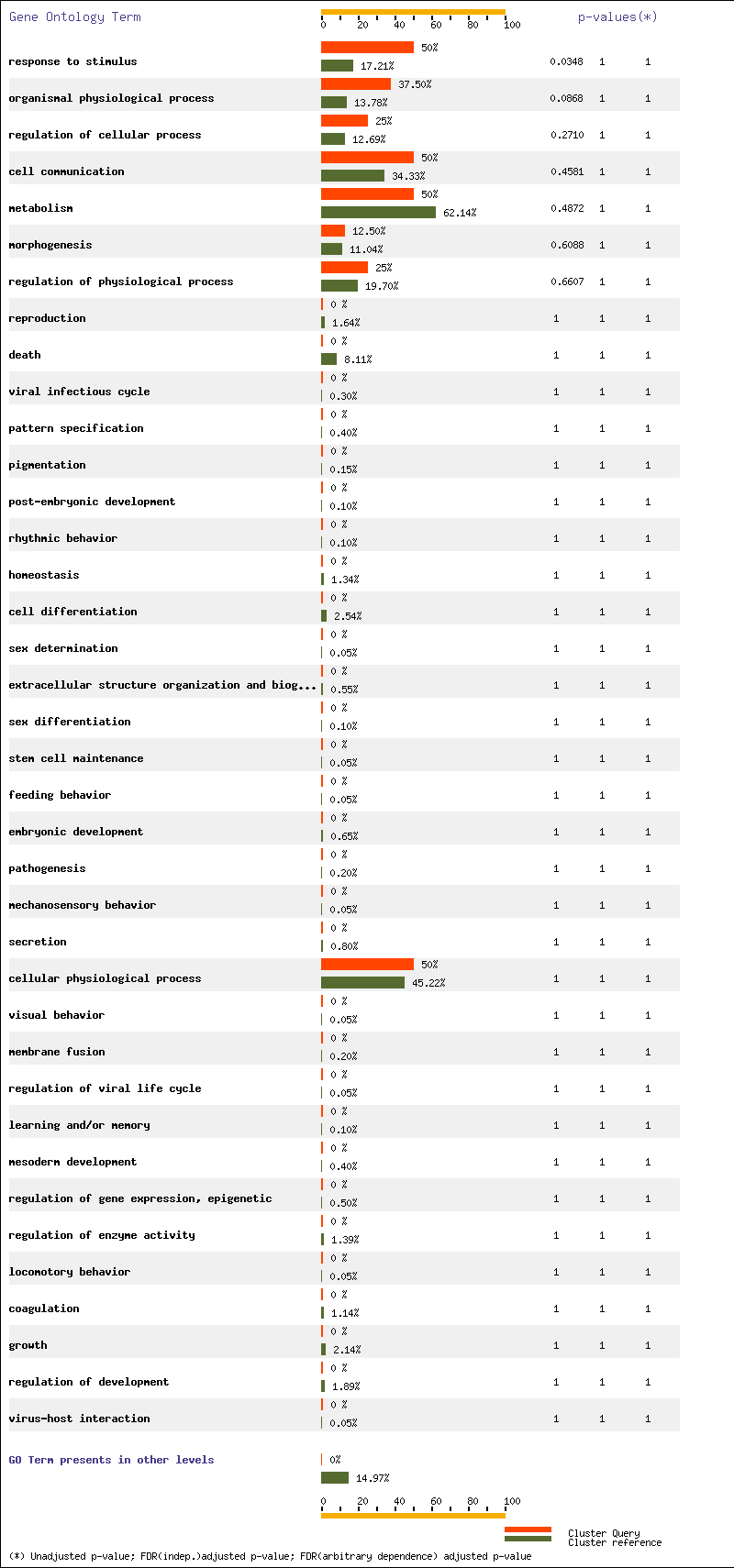
For Ontology biological process and level 3 we have three terms with p-value < 0.05 : cellular physiological process, response to stimulus and metabolism

Go to data sets page by clicking here:
As you have repeatedly been told, if you have your own data, feel free of using our server:
Also, you can take a look to our on-line courses at:
- Vaquerizas, J.M., Dopazo, J. & Díaz-Uriarte, R. (2004)
DNMAD: web-based Diagnosis and Normalization for MicroArray Data.
Bioinformatics, doi:10.1093/bioinformatics/bth401 (in press).
- Herrero, J., Vaquerizas, J.M., Al-Shahrour, F., Conde, L., Mateos, Á., Santoyo, J., Díaz-Uriarte, R. & Dopazo, J. (2004)
New challenges in gene expression data analysis and the extended GEPAS.
Nucleic Acids Research 32 (Web Server issue), W485-W491.
- Al-Shahrour, F., Díaz-Uriarte, R. & Dopazo, J. (2004)
FatiGO: a web tool for finding significant associations of Gene Ontology terms with groups of genes.
Bioinformatics 2004 20: 578-580; (See the technical report.)
- Herrero, J., Díaz-Uriarte, R. & Dopazo, J (2003)
Gene Expression Data Preprocessing.
Bioinformatics 19(5), 655-656
- Herrero, J., Al-Shahrour, F., Díaz-Uriarte, R., Mateos, Á., Vaquerizas, J.M., Santoyo, J. & Dopazo, J. (2003)
GEPAS, a web-based resource for microarray gene expression data analysis.
Nucleic Acids Research 31(13), 3461-3467- Herrero, J. & Dopazo, J. (2002)
Combining Hierarchical Clustering and Self-Organizing Maps for Exploratory Analysis of Gene Expression Patterns.
Journal of Proteome Research. 1(5), 467-470.
[Additional information]
- Dopazo, J. (2002)
Microarray Data Processing And Analysis.
Microarray data analysis II. Kluwer Academic. Publ. Pp. 43-63.
- Herrero, J., Valencia, A. y Dopazo, J. (2001)
A hierarchical unsupervised growing neural network for clustering gene expression patterns.
Bioinformatics, 17(2), 126-136
- Westfall,P.H. and Young,S.S. (1993) Resampling-based Multiple Testing: Examples and Methods for p-value Adjustment. John Wiley & Sons, New York.
- Benjamini,Y. and Hochberg,Y. (1995) Controlling the false discovery rate: a practical and powerful approach to multiple testing. J. Royal Stat. Soc. B, 57, 289-300.
- Benjamini,Y. and Yekutieli,D. (2001) The control of the false discovery rate in multiple testing under dependency. Annals Stat., 29, 1165-1188.